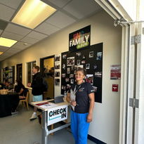
As the Social Creative Specialist for the Centers of Equity at SBCC, I was tasked with creating a welcoming and colorful visual identity that reflects the center's mission.


1. Visual Identity:
-
Color Palette: Introduced vibrant, inviting colors to align with SBCC’s diverse and energetic student body.
-
Typography: Used friendly and approachable fonts to enhance readability and warmth.
-
Imagery: Prioritized inclusive, relatable visuals of students and campus life.
2. Content Pillars:
-
Educational: Simplified resource explanations with colorful graphics and digestible text.
-
Community: Highlighted student stories, events, and testimonials to foster a sense of belonging.
-
Awareness: Promoted services with vibrant, high-impact designs during critical periods (e.g., finals week).
3. Enhanced Accessibility:
-
Ensured that all posts conveyed an inviting tone to remove barriers to seeking help.
-
Included captions and alternative text for images to increase inclusivity.

- Follower growth increased by 15% within three months of the rebrand with +62.5% total.
- Engagement increased 50% in likes, shares and comments.
- Events promoted after the rebrand saw a 25% rise in attendance.
The results demonstrate the power the thoughtful design and messaging in fostering a supportive community and encouraging students to seek help when needed.


